Design Diaries
Somewhat lacking in essential irony, sarcasm and disgust
Chris Dent
SLIS L542
December, 2001
Somewhat Augmented
When I was employed by Kiva Networking, one of the authority figures decided we’d all stop whining about the lack of communication in the workplace if we were given a bribe. The bribe took the form of a Palm V handheld. Most people set them somewhere, forgot about them, and continued whining. I, on the other hand, thought it was a wonderful tool and used it to make my whining more effective: I used the Palm to remember. When I left Kiva the Palm, sadly, stayed behind.
A favorite piece of learning from my time in SLIS has been exposure to Doug Engelbart and his notions of augmentation. Engelbart’s version of augmentation includes the extension of human capabilities by putting a human together with the “artifacts, language and methodology” necessary to make effective use of “information-storage, information-handling and information-display devices” (1962). These ideas dovetail with many of my own unarticulated thoughts on computing. When I started this semester I realized that in addition to talking the talk of augmentation, I wanted to start walking the walk. I went out to buy a Palm device with the intention of keeping notes, to do lists, contacts, and thoughts of all sorts within.
I’m doing those things and it has been quite successful[1] but things could be better. This is the case with many of what Landauer (1995) calls phase two applications—applications designed to help people do useful work. A great deal of energy has been spent to create powerful computers but not enough energy making them useful.
The Palm provides an effective memory augmentation function. When I recall a thing I need to do, think a thought I wish to remember or hear an especially salient lecture sound bite the Palm is there to keep the information but is unable to make relationships between the pieces of information. If I think a word but do not know what it means, I can look in the dictionary[2] that is on the Palm but it is slow. If I wish to share a thought with someone I can write him or her an email message on the Palm but I must wait to mail it until later.
As described elsewhere in this diary, the Palm is divided up into various applications amongst which there is little communication. If I write a memo and later decide I want it to be part of an email message, there is no facility other than cut and paste (which is limited by number of characters) to get the text into an email message. If I write a memo and think a particular part from another is relevant there is no way to link it in. If, in an email message, I want to tell someone about my schedule for the next few days, I cannot include a section of my calendar.
A fully functional augmentation device would include a dictionary fast enough to keep the user in a conversation where the vocabulary was somewhat out of their reach. To use the Palm dictionary, you must stop what you are doing, start the application, enter the word, request a search and read the definition. I should be able to highlight a word anywhere on the palm and issue a ‘define’ command and get results immediately. As things are the computer is very much in the way. The Ubiquitous Computing project at Xerox PARC has been concerned with “getting the computers out of the way while amplifying human-to-human communication” (Weiser, Gold, Brown 1999). The Palm, as a traveling small information appliance fits into the ubiquitous arena but to truly be an augmenting device it needs to get out of the way.
The Palm is an asynchronous device. Through conduits you can fill it with information from other computers in your home or office and on the Internet, and you can dump information from the Palm to other computers. These, though, are actions that happen at intervals—when you are in the office, when you are at home—when you are near the Palm’s cradle. In order to be truly effective an augmentation device must have immediate access to other resources synchronously. For example if my local dictionary does not have a definition the system should be able to query externally for more information.
In the short term I believe there are some things that the Palm Company should consider for future developments:
· Palm applications are always on, their state is constantly maintained. The notion of saving data does not exist on the handheld. Because of this I believe it should be possible to maintain hypertextual transclusions[3] amongst data and documents on the Palm.
· The dictionary software can be optimized by storing the application and the dictionary index, but not the definitions, on the palm itself (where the memory is faster). This is already done with the Noah Pro dictionary software for Palms[4] but the dictionary they use is small and thus not of much use (to me).
· The dictionary software can be made more effective by adding a define function into the operating system in a similar fashion to cut and paste. When a word is highlighted it should be possible to select a define command. This is not a new idea; it was done in the NextStep operating system from the beginning. It was nice, very nice.
· The Palm should be made a wireless device. They tried this before with the Palm VII but the system used maintained the asynchronous, only connect at intervals, nature of the syncing mechanism. 802.11 wireless adapters are now available for the Palm. I would like to buy one but it is not yet clear of IU’s wireless network will interoperate with the cards. With continuous access to the network, mail could be sent and received, backups performed and web researching accomplished anywhere there happened to be an accessible network.
With those four adjustments I believe I would be well on the way to feeling augmented in an unobtrusive fashion.[5]
Dear Honda,
I have
a Black 1999 Honda Prelude. It is yet another example of consumption to
compensate for overworking. It’s a lovely car. When I purchased it, I knew what
I wanted: I wanted a Prelude. It made choosing a new car much easier. My
desires were supported by excellent reviews in the auto press where the car
easily out performed other cars in its class (sport coupe). There were warnings
of a poorly designed console but I ignored them because, as I said, I wanted a
Prelude.
Two
years later I still love the car but the poorly designed console continues to
get in the way. The most aggravating problem is the control for the sunroof: it
is difficult to use in the way I would like. In the summer I drive with the
windows and sunroof open. When I reach my destination I want to close all of these
things at once. This is problematic:
·
The
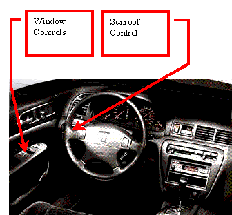
controls for the windows and the sunroof are to my left, but not close
together. I can control both windows with one hand on the door armrest, but a
second hand is needed to reach the sunroof control located on the dashboard to
the left of the steering wheel (see included photo). Doing this all at once
requires an awkward motion of crossing my right hand to the armrest while my
left hand goes for the sunroof button. To close these windows I must press and
hold buttons until the windows are fully closed.
·
Because
closing all of these items is a challenge I find I forget them. The car
provides no indicator, while in the car, that the windows or sunroof are open.
With the windows it is fairly obvious but looking up to the sunroof is not
something I do very often.
·
If
I’m driving and it starts to rain I have to do some complicated actions to get
everything closed in a hurry. I’d rather not do other complicated things while
I’m driving.
I’ve
walked away from the car with the sunroof open many times. I’d rather not do
this so I’d like to see Honda make a few changes:
·
Please
provide an indicator on the dashboard that shows the state of the sunroof so I
can know with a forward glance (where I’m normally looking in the car) if I
need to close it.
·
Please
provide an audible warning if I’m about to leave the car with the sunroof open.
This is already done with the headlights, a function I find helpful. Perhaps I
am a forgetful person.
·
It’s
clear you are aware of this problem as you’ve made it possible to close the
sunroof with the battery power off but only until I open the door. If I open
the door the power goes away. How about a five minute window so that as I
glance back lovingly at my car and see the sunroof open I can return to the car
and close the roof without needing to turn the key?
·
Move
the sunroof control. Options include:
o
Put
it with the window control panel on the armrest.
o
Move
all the window controls to the center hump of the car (a la Saab).
o
Put
it on the roof console with the interior lamp.
·
Allow
for some automation:
o
If I
lock the doors and then close the door but the sunroof is open, close it for
me.
o
Put
a sunroof close button on my remote entry key fob.
I’m not
sure which of these solutions is best so you might check out the following
references for some direction:
·
Stammers
and Shepard (1995) recommend task analysis as a tool to determine the
requirements, environment and behavior of a task. I suggest that you follow
their advice and do some task analysis to determine the goals of the driver,
the situation they are in and the necessary actions involved in closing the
windows and sunroof. This should lead to useful initial prototypes.
·
Then
you might use these prototypes to do some testing of the design to determine
what you forgot (for surely you will forget something). Virzi, Sokolov and
Karis (1996) have demonstrated that
“low-fidelity prototypes can be effective through the product development
cycle”.
·
Your
design process will not be complete without some user performance tests.
Shackel (1991) suggests “full experimental studies of final equipment with
samples of actual users, using measures of dimensions, performance and
attitude.”
The combination of task analysis, prototype testing and user testing should get you started on an iterative process of design and evaluation that will lead to an effective interface for the sunroof. I don’t think you did this the first time around. If at some point during that process you need to do some longitudinal studies of in car behavior I’m happy to volunteer.
Application Switching in the Palm of my Hand
Palm Pilots are marvelous little devices. A few years ago, it was hard to imagine such a small device providing the sorts of services a Palm can provide. They do a lot; I want them to do more.
Because of their small screen size a Palm usually has one application viewable at a time. The interface provides two different methods for switching between applications:
·
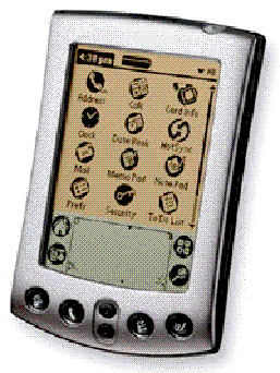
For the applications considered of primary importance
by the Palm designers there are buttons at the bottom of the device that cause
the system to switch to the chose applications (see attached image).
·
For other less important applications the process is
more complex. The user must:
o
Select the “Home” button and wait for the application
list to show up.
o
Select the application from the list and wait for the
application to start.
This may not seem too complicated but consider the following scenario: I decide to write an email message to a friend. I select the “Home” button and select “Mail” from the list. I begin the message and then realize there is something in my memos that I would like to include. I choose the “Memos” button on the system, find the memo that is important to me, read through it, find the text I want and copy it. To return to the mail message I was composing I must select the “Home” button and then select “Mail” from the list of applications. This takes me back to the message I was working on, but I then must navigate my way back to the part of the message I left. If I then decided I’d like to spend some time with the person I’m corresponding with, but I don’t know what my schedule is, I must go through the whole process again, this time pressing the “Calendar” button instead of the “Memos” button. The process is even more complicated if I want to access an application that doesn’t have a button, such as the Dictionary program: I must select the “Home” button, select the “Dictionary” application, search for the word I want, choose that word from the provided list, read the definition, press the “Home” button, select the “Mail” application and navigate back to my text. This is extremely cumbersome. I find that I frequently forget where I was, why I went down a certain path of applications and how to get back to what I was originally doing. This is unfortunate in a device that is supposed to help me remember things.
Two possible solutions to this problem are:
· A button could be added, either physically to the system or to the graffiti area (where one writes), which acts as a task switcher. Pressing this button would return the user to the most recently used application. With this, if I am in “Mail” and take a trip to “Memo” pressing the task switcher button while in “Memo” will return me to “Mail”. Once that is done, pressing the task switcher button while in “Mail” will return me to “Memo”.
· A similar button could be added that, when pressed, causes a popup window to appear on screen showing the N most recently used applications. Selecting one causes the system to jump to that application.
Having either of these would solve one of my primary
complaints with the Palm system. I understand that Palm has a fairly robust
user and user centered design orientation however if we use the measurement of
usability provided by Sweeny, Maguire and Shackel—“usability may be measured by
the extent to which the IT affords (or is deemed to be capable of affording) an
effective and satisfying interaction to the intended users, performing the
intended tasks within the intended environment at an acceptable cost”
(1993)—the Palm is not being optimally usable. I assume I’m an intended user as
I bought the thing and nobody stopped me. It may be that I didn’t fit the user
model that Palm used when creating the Palm but as Dillon and Watson remind us
“the ever-widening user population resulting from the diffusion of technology
means it is no longer enough to base ergonomic inputs on generic models of the
users” (1996). I can’t predict my own personality or cognitive style but I’m
sure it plays as large a part in what I desire a Palm to do as it does in my
desire to have one.
Televisions: Menus of Confusion
Once upon a time, in a land not too far away I was employed in such a way to allow me certain freedom in the audio-visual department of the store. So I bought a nice TV to go with my nice DVD player, stereo, speakers, etc. I was awash in a sea of consumer electronics, all lying around doing nothing, attempting to compensate for my overworked state.
I no longer have freedom in the audio-visual department but I still have the goods and I enjoy them. My brother recently moved in and decided that what my TV needed were channels[6]. He attached an antenna to the TV and we danced along with the TV’s configuration menus, had some adventures, and tuned in PBS. Just PBS.
In the process a feature was revealed on the TV that had me stumped. The remote control includes a pair of up and down arrows labeled “favorite” and an additional button nearby labeled “favorite” as well. What’s a favorite? Pressing the “favorite” button divides the TV screen up into a 4x3 grid of miniature screens. Each contains some static. That’s no good. Pressing the “exit” button takes me back to the normal TV display. Pressing “favorite +” raises the current channel. This is especially odd because the buttons for changing the TV channel don’t seem to do much other than change the channel to the current channel.
Being a funky consumer electronic veteran, I decide to view the configuration menu. This menu is divided into a hierarchy. The top level contains four choices. “Prefs” makes sense so I choose it. Navigation switches from left to right for choices, to up and down. I scroll down until I find “Favorites” listed. At this point the screen looks a bit like this:
|
Favorites |
Add |
Clear |
|
|
|
|
2 |
3 |
4 |
5 |
|
|
6 |
7 |
8 |
9 |
|
|
10 |
11 |
12 |
13 |
When I am seeing this, what I have in my hand is a remote control that has as its focus a directional control that points up, down, left and right. My intuition is to use the remote to go to “Add” or “Clear”, somehow select that action and then migrate into the numbers and press the “Enter” button on the channel I want to add or clear. Moving to “Add” or “Clear” and pressing “Enter” does nothing that I can discern.
Then I realize something. The numbers listed in the “Favorites” control menu are purple. The numbers I’m seeing when I view my PBS are green. That’s green for broadcast, purple for cable. I don’t know how I know that. This indicates to me that the items in the Favorites menu are cable channels.
I switch the TV tuner to pay attention to cable and put it on channel 2, go back to the “Favorites” control and move around and press “Clear”. Now the screen looks like this:
|
Favorites |
Add |
Clear |
|
|
|
|
3 |
4 |
5 |
6 |
|
|
7 |
8 |
9 |
10 |
|
|
11 |
12 |
13 |
|
That’s a change. I guess one has to be in the cable section of the TV to remove channels. I press clear again expecting 3 to go away. It does not. Damn. I try pressing the channel up button thinking that will allow me to remove 3. It does not. The TV exits from the menu and goes to channel three. I take myself back to the menu, and press clear again. 3 goes away.
I find this hard to believe but apparently I have to be on a channel to remove it from the favorites list. That means to clear up this mess I have to go through an enormous number of motions to clear each channel. Oi. I do that, for the sake of this important research.
When the favorites are all clear, I return the TV to broadcast mode and add the PBS channel to “Favorites” and press the “favorites” on the remote control. Now it becomes clear what the favorites do:
· They allow the semi-simultaneous display of up to 12 channels at once, rotating the screen motion through one channel at a time.
· They allow the user to select a grouping of up to 12 channels through which the user can browse with the remote control.
These are useful features; I’m glad that I know about them. They’ll prove handy when I have some channels. It should not, though, take me an hour to figure out what they are or how to use them.
This TV was expensive and is filled with a mass of electronics doing all kinds of fancy stuff. I’m sure that somewhere in there is room for a bit of help. The configuration system would be greatly improved by the presence of a help system that would allow me to press a remote button while in the menu to get an explanation for the current category. I suspect much of this stuff is explained in the manual, but I’ve moved this TV amongst homes. I don’t know where the manual is and I shouldn’t need it anyway, Donald Norman has told me I should try and not blame myself for the failings of an interface (Norman, 1988).
I’m sure this particular interface would appall him. The designers have ignored much of the design aid advice generated from his seven stages of action model:
1. “Visibility. By looking, the user can tell the state of the advice and the alternatives for action.”
· Nope. I didn’t know from looking at the menu what I could do.
2. “A good conceptual model. The designer provides a good conceptual model for the user, with consistency in the presentation of operations and results and a coherent, consistent system image.”
· There is a lack of consistency throughout the menu system. Channel oriented options in one area do not perform similarly in another.
3. “Good mappings. It is possible to determine the relationships between actions and results, between controls and their effects, and between the system state and what is visible.”
· Clearly not. I knew neither what to do, nor what would happen if I experimented.
4. “Feedback. The user receives full and continuous feedback about the results of actions.”
· When I did experiment I was unable to determine the (failed) results of my actions. As far as I was aware, I didn’t even know if the computer in the TV had heard me.
The designers could also do well to listen to the other Norman, Kent. The “Favorites” menu appears to represent a small hierarchical structure, “organizing information and reducing the number of alternatives” (1991) to be considered. The menu identifies two actions that can be performed on a list of channels. Norman focuses his attention on larger hierarchical structures but one of his primary points can be applied here: items in menus are frequently ambiguously worded, leading to confusion for the user. This was certainly the case for me. Renaming the menu items, however, would not help much because there is yet another problem that must go away.
The Apple Computer Human Interface Principles (1992) encourage modelessness in applications. However they also state: “Other modes are acceptable if they…block most other normal operation of the system to emphasize the modality.” The “Favorites” menu would be improved by being fully modal. In its current configuration the channel buttons continue to work to change the channel of the TV while the user’s focus is on adjusting the “Favorites”.
My recommendation is to adjust the “Favorites” menu to two different processes. Adding to the Favorites list should occur from the remote control while watching a particular channel. There should be no need to enter the configuration menu. A simple press of a button on the remote would add the favorite to the list. To remove a favorite two options should be available:
1. A remove favorite button on the remote control should remove the current channel from the list.
2. In the configuration menu a “Remove Favorites” entry should exist wherein the channel buttons could be used to scroll the list of favorites. Pressing the remove favorite button on the remote control takes entries off this list.
Okay I’m in here now, but how do I get out?
I have the dubious honor of doing some work for a department in the library[7]. They have a lot of data management issues that have been sidelined for a long time. I came along in a somewhat unexpected fashion so my task with the group could be described as “Help us with all these things that are falling through the cracks. Oh, do you happen to know Access?”
When I arrived at the job I didn’t know Microsoft Access but I guessed I could figure it out. This has proven to be the case for the most part, but problems at the interface and environment levels have left me somewhat less than able to solve the problems I was assigned.
The library uses a database product known as Unicorn to keep track of its holdings. Unicorn has its public persona, IUCAT, and its private persona, Workflows. Workflows is an abomination. It’s so horrible that I can’t bring myself to open it up enough to analyze it for a design diary entry. Really.
Based on my ongoing observation of the office culture on the third floor of the library, Unicorn is loved and despised by the staff. Despised because it makes everything hard. Loved because it makes everything hard. There’s always something to blame.
My first task was to create a database system that would be used to notify staff members of the impending expiration of subscription based resources. My group is frequently on the receiving end of glares expiration dates are missed. I asked, “Isn’t this information in Unicorn?” The response was a bit vague: apparently there are some fields there, but they are hard to use, so people haven’t been using them. In addition there is no system to report expirations. The guy who is responsible for scripting reports is unavailable for a year or more. I’ve had experience with database management so I asked, “What about me, can I get in there and do some work. I just need access to the database, nothing complicated.” On the surface this was apparently a great idea but it never went beyond the conference room. My enthusiasm was appreciated but some unseen force was putting the kibosh on any real initiative.
I set about creating a simple database that would keep track of resource names and expiration dates. It would also record a reference to the Unicorn database in a hopeful gesture towards future integration. I asked about the availability of resources and discovered that the cultural gaps between my co-workers and me and between my co-workers and the technology managers at the library were larger than I was able to imagine. The attitude was very clearly “This [(Access)] is all we’re given and we take what we’re given because that’s how things are for us.”
So I made my way into Access to discover that my real world struggle was going to be reflected there: any time I tried to do something I thought was fairly reasonable I came up against a roadblock that violated my expectations. Case in point: When you start Access it presents you with a screen arranged as shown in Figure 1. The things on which you can operate (Tables, Queries, etc.) are arranged on the left and the tasks that you can perform for the currently selected object are arranged on the right with somewhat explicit labels. Just above are additional operations. This interface sets up my expectations for the entire application. Shame on me. Double clicking on “Create table in design view” reveals Figure 2[8], covering Figure 1. We’ve gone from a moderately well labeled interface that tells you what to do to a blank slate. When the window first opens the blue text in the lower right reads, “A field name can be up to 64 characters long, including spaces. Press F1 for help on field names.” It changes as you click around the window but the information it provides describes details. Very little information is provided that tells you what to do.
And how the hell do I get out of this thing?
I still don’t know the proper way to move on to the next operation when I’m done working with the current table. Am I supposed to minimize the window? That causes trouble with other operations that won’t work if the table is open. Where is the close operation? I don’t seem to have that option. What I’ve chosen to do is hit the X button in the top right of the window. That does the trick, but is not something I’m comfortable with: that’s killing the window. Isn’t that a bad thing?
There are several intertwined issues at play here. My own troubles with Access could be solved by changes in the organization but that is unlikely to happen. The organization is entrenched a massive power struggle where everyone is crouched in a barely balanced defensive stance. So much energy is being spent on this struggle that very little is getting done.
Eason and Markus would have a field day writing about the socio-technical system in the back rooms of the library. The implementation of Unicorn and imposition of Access falls apart in the face of Eason’s 10 propositions (Eason 1988). For example, proposition two states that “the design target must be to create a socio-technical system capable of serving organizational goals, not to create a technical system capable of delivering a technical service.” According to my co-workers Unicorn was primarily installed because it had a web based online public access catalog. Proposition four states that “the design of effective social-technical systems will depend upon the participation of all relevant ‘stakeholders’ in the design process.” Once again, according to my co-workers there was very little involvement requested of or demanded by the people in the trenches, doing cataloging and other resource management tasks. It’s no wonder that the workers feel no sense of participation.
Markus would want to talk about the political environment (1987): the installation of Unicorn involved a rearrangement of power and resources in the library. People with established skills operating the old system, but lacking adaptability find themselves needing the assistance of other more adaptable staff. The more adaptable staff are reluctant to help because frequently they have less seniority than the more ossified staff.
What, you may ask, does this have to do with my experience with Access? The socio-technical environment required people to determine workarounds to satisfy their needs. I was assigned to the Access projects by staff members trying to work outside the system: they saw the stiff structure of the system, saw an impossible path there and looked around for other resources to get things done.
While fixing the environment at the library will probably take more than a design diary to solve, I think we can fix Access. Is it the province of the weak to go to the Apple Computer Human Interface Principles more than once in a design diary? Perhaps, but the advice is clear in this case: “Use the standard elements of the Macintosh interface to ensure consistency within your application and to benefit from consistency across applications.” Microsoft Windows applications do have a set of standard elements; it is remarkable, though, how often Microsoft themselves decide to do something a little different for some special purpose. I would expect them to at least maintain consistency across applications within the Office suite. They don’t and that cuts down on my power to get things done.
My recommendation is simple: When Access launches new windows, content sensitive menus and tools bars should be attached to those windows in a consistent fashion. A “Done” or “Next” button should be provided (depending on whether a forward or returning action is being performed) on each window. These two things together will cause the application to be more consistent with the mental model of Access that I create when I first start the program. I use that model to predict the relationships between the inputs and outputs of the program (Eberts, 1994). When I create the mental model it runs in a particular fashion in one mode of the program but breaks in another mode of the program. To have consistency I need the model to map throughout the application.
My recommendation for the library is radical restructuring
of the staff, but I bet that will go over rather poorly.
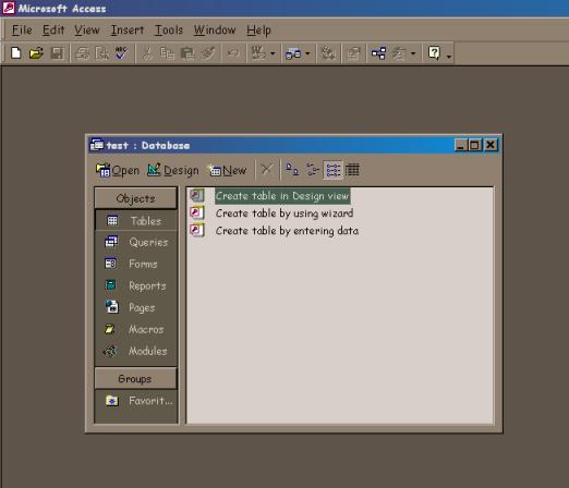
Figure 1 My expectations are set.
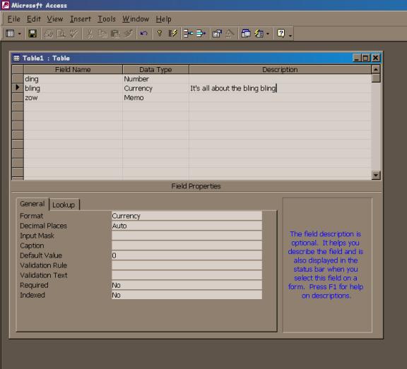
Figure 2: What now?
References
Apple Computer (1992). Human interface principles. In Macintosh human interface guidelines (p. 3-14). Addison Wesley.
Dillon, A., Watson, C. (1996). User analysis in HCI. International journal of human-computer studies 45(6), 619-637.
Eason, K. (1988). Towards the socio-technical design of information technology. In Information technology and organizational change (p. 44-59). London: Taylor and Francis.
Eberts, R. (1994). Mental models. In User interface design (p. 139-163). New York: Prentice-Hall.
Engelbart, D. C. (1962). Augmenting human intellect: A conceptual framework. Retrieved December 3, 2001 from http://www.histech.rwth-aachen.de/www/quellen/engelbart/ahi62index.html.
Landauer, T. (1995). The trouble with computers. Cambridge, MA: MIT Press.
Markus, L. (1987). Power, politics and MIS implementation. In The social impacts of computing (p. 68-82).
Norman, D. (1988). The psychology of everyday actions. In The psychology of everyday things (p. 34-53). New York: Basic Books.
Norman, K. (1991). Search behavior in hierarchical menu structures. In The psychology of menu selection (p. 214-236). Norwood: Ablex Publishing.
Stammers, R., Stammers, A. (1995). Task analysis. In N. Corlett and J. Wilson (eds.) The evaluation of human work (p. 144-168). London: Taylor and Francis.
Sweeney, M., Maguire, M., Shackel, B. (1993). Evaluating user-computer interaction – a framework. International journal of man-machine studies 38, 689-711.
Virzi, R., Sokolov, J., Karos, D. (1996). Usability problem identification using both low and high fidelity prototypes. In Proceedings of ACM CHI 96 conference on human factors in computing systems (1), 236-243.
Weiser, M., Gold, R., Brown, J.S., (1999). The origins of ubiquitous computing research at PARC in the late 1980s. IBM systems journal 38(4), 693-696.